8 Introduction
In January 1998 the Legion simulation was used to model five sections of the Hong Kong Jockey Club. This section is a summary of the application of the Legion system and presentations of some of the simulation data and results. The project covered two different race courses in Hong Kong; Happy Valley and Sha Tin. Three areas at Happy Valley and two areas at Sha Tin were modelled. The areas had a major impact on the smooth and safe running of events at the two venues.
The scope of the project was to identify the problems, propose solutions, and finally to produce a comparative analysis of the effect of the suggested changes. In this case the simulation provides us with a method for qualifying the before and after scenarios. We illustrate four of the five areas; area II (Figure 155) has been excluded.
8.1 Overview of the Hong Kong Jockey Club
There are two racecourses in Hong Kong; Sha-Tin and Happy Valley. Both are owned and operated by the Hong Kong Jockey Club and both are in urban areas, surrounded by high rise blocks of flats and office buildings are served by the MTR (Mass Transit Railway).
8.2 Attendance statistics
Legion was provided with a series of statistics, data and video footage for the five areas covering several race meetings. Figure 153 shows the graph of number of patrons attending the two venues. During a season the attendance fluctuates with peaks at 80,000 for the most popular events at Sha-Tin and 40,000 at Happy Valley. These data indicate the ingress (arrival) rates and we can use this type of data to assess the field data against the peak and normal attendance figures.
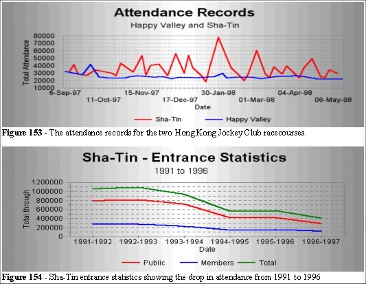
Figure 154 shows the drop in attendance for the period 1991 to 1996. We use this data to assess the long term trends in attendance, if the graph were rising we can estimate the future attendance and design crowd management factors in accordingly.
8.3 Area I - Happy Valley public entrance
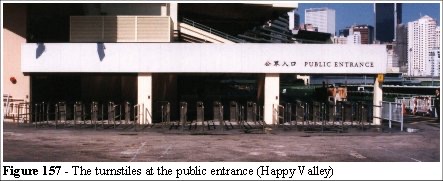
The racecourses have two types of patron; members and public. The members pay an annual subscription and use different entrances from the public. The public pay on entry to the racecourse and their entrances are via coin operator turnstiles. The public entrance at Happy Valley consists of a bank of seventeen turnstiles (Area I in Figure 155). The turnstiles are approached from both left and right (in Figure 155).
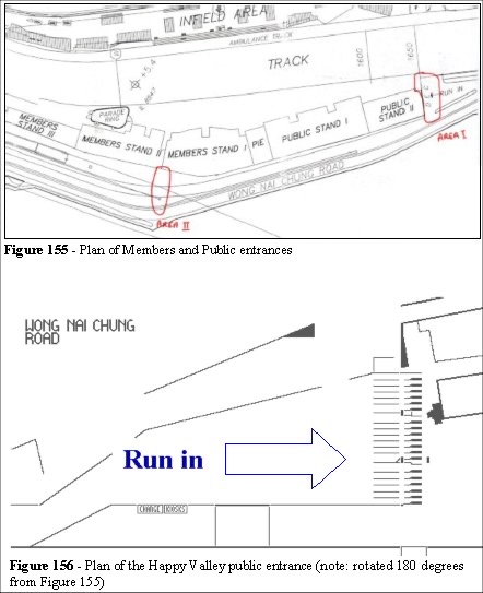
Access is by correct change only. Change kiosks are located near the entrance along the approach path (Figure 153). The location of these booths was based on the observation that the bulk of the public pass this area.
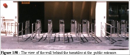
To the left (Figure 157) are two turnstiles which go into the grandstand; this is where the on-site betting takes place. These two turnstiles are used for Staff and season ticket holders. The middle section has a solid brick wall (Figure 158) immediately behind the turnstiles.
8.4 Public entrance - focal route analysis
Focal route analysis requires very little operating knowledge of the site. In Figure 158 we show the primary routes to the turnstiles and change kiosks.
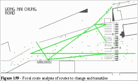
Figure 159 shows an immediate problem in the area. There are Multiple Path Interferences where focal routes to and from the change booths cross the focal routes to the turnstiles. Figure 160 shows the distribution statistics from the turnstile computer average over several events. We see that the triple peaks are as expected from a normal distribution curve with the focal routes indicating the centre of the three peaks.
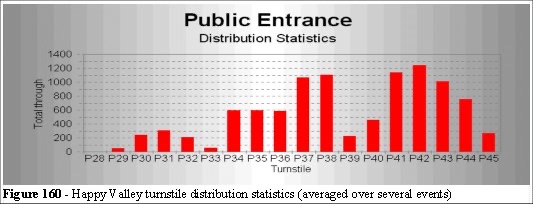
The right-hand side of Figure 160 is to the top right of Figure 159. P39 is obscured due to the pillar in Figure 159 (middle right-hand side). There is very little clearance behind the turnstiles in this area. The turnstile distribution statistics show this. The wall (Figure 158) has an impact on ingress rates and the total number of people trying to enter this area (arrival rate) is considerably less than service capacity of the turnstiles. A multi-channel queuing model of this area would not show the bias to the turnstiles which have a clear view beyond the entry system.
The problem we were asked to address, in this area, related to congestion in the run in and around the change kiosks, which were described as "chaotic".
8.4.1 Public entrance statistics
The graphs (Figure 161 and 162) show the ingress flux (flow rates across time) and are averaged over the multiple events. As we can see, the maximum flux occurs at the periods 13:00-13:30 and 19:00-19:30. These rates are the maximum operational flux and the relevant video footage was used to calculate the numbers, distribution, direction and patterns of crowd movement.
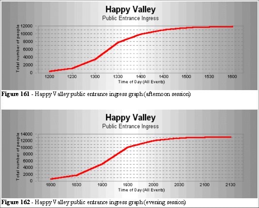
The maximum flux occurs at the steepest slope on the graph (Figures 161 and 162) which is 5000 people in 30 minutes. We can test the multi-channel queuing of the turnstiles, but with 18 available with service rates of 50 people per minute (total of 900 people per minute), the arrival rate of 166.67 people per minute the arrival rate is very much less than the service rate. There are ample (wasted) turnstiles and both theory and field observations confirm that the problem is not at the turnstiles.
8.4.2 Ingress rates - flux
From the video analysis we found that 20 to 30 percent of the patrons used these two change booths to obtain correct change for the turnstiles. We also measured the ingress rates (flux) to determine the peak periods for the model. From the focal route analysis we identified the potential cause of the complaint.
From the Wembley ingress capacity analysis (Section 2.7.2) we discussed how the flux (an ingress rate) can provide useful data. The Hong Kong Jockey club archives the ingress rates, and we can use these data to assess the maximum flux rates, together with how they change with time of day, time of year and year by year.
Video cameras were used to record the ingress and head counts were made at every focal route. The results can be seen in Figure 163.
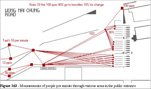
By using the same acetate overlay technique developed in the Balham study we can measure the focal routes. We note that each route is normally distributed in width in that people overtake left and right with equal frequency. The width is a function of the number and speeds of people using that route.
8.4.3 Public entrance - present design
From the figures supplied by the HKJC of majority of attendees arrive within one hour of the start of the first race. In the entrance area patrons have a number of choices: the can enter the stands via the season ticket holders’ turnstiles or via the coin turnstiles. Some have to go to the kiosks to get correct change.
People who need change have to cross the path of those who have either the correct change or have already been to the kiosk. This results in a multidirectional flow as can be seen in the focal route analysis in Figure 159. Figures supplied by the HKJC show that during one monitored event 2,396 people out of 9,774 (24.5%) used the change kiosks. The service times were 3 seconds with a choice of two kiosks.
At these rates queuing theory predicts between 2 and 7 people waiting !
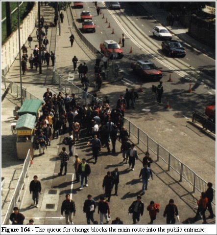
Figure 164 clearly shows a congestion problem in this area. The queue starts to build as people wait for change. The approach to the main area is through the queue (Figure 159). This quickly fills the area in front of the kiosks, and the approach to the public entrance is blocked. Queuing theory alone did not quantify this problem. The main cause for the apparent chaos is the location of the change booths (on a primary focal route), leading to multiple path interference. We have confirmed our hypothesis and can now postulate some rules for optimal design of an environment where large crowds need access.
- Rule 1: Keep the focal routes clear
- Rule 2: Focal routes should not intersect.
The present locations of the kiosks have another effect on the crowd, apart from the potential of blockages seen in Figure 164. As the position of the change kiosks is located far from the turnstiles, customers have to queue twice, once for the correct coin and once more to gain access to the stands. The two queues, approaching from opposite directions, clash and the congestion is a not just the result the service rate, but also of the additional time it takes to navigate back through the crowd.
In practice we could add this time to the service rate however the simulation can be applied to assess the impact of moving the change booths without the need for complex analysis. Furthermore the methodology of focal route analysis allows us to use simple geometric rules to determine the optimum location for the change booths. Using the above rules we can assess how closing the gap in the fence and routing all the patrons in the same direction would eliminate the congestion.
8.4.4 Alternative designs
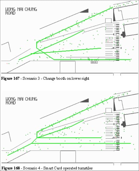
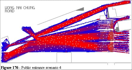
There are then two locations for the change booths (Figures 165 and 166) which allow a more streamlined flow pattern. One of these (Figure 165) can be configured as single or double sided booths. A fourth alternative, using smart cards instead of correct change, was also simulated.
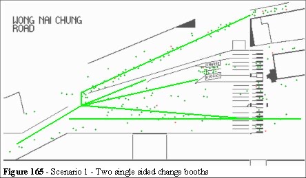
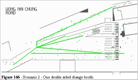
Queueing theory gives the same quantitative results for the depth of queue with respect to arrival and service rates for Figure 165 and 166. The simulation provides us with a quantitative analysis of the distribution and use of the booths.
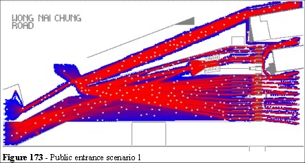
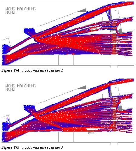
The design for scenario one (Figure 165) shows a range of changes to the present layout, the gap in the fence has been closed, there is now a larger area between the corner of the stand and the entry point to this area. If a problem arises in this layout there is an area where people can queue which does not impede other activities (such as the Members, Staff entrance etc.) or the major flow routes. Also, the flow of people entering this area results in more evenly distribution of the space usage (the space utilisation function). This is created by better overall lines of sight and direction choices. Other changes are the location of a new barrier running parallel with the original. This forms a sterile area allowing season ticket holders access to their turnstiles. Further changes include the positioning of the change kiosks which would be located in front of the group of turnstiles that at present are underused (Figures 165 and 166).
The new position levels the crowd distribution at the turnstiles whilst streamlining the flow of people entering the area behind the change kiosks. From the focal route analysis we can see that there is still some multiple path interference, but it has been minimised. Scenarios 1 and 2 have the fewest focal route intersections as they progress towards the turnstiles. We now use the Legion simulation to analyse the impact to the crowd with these configurations. This is quantitative analysis comparing the same arrival and service rates but changing the geometry.
8.4.5 The Legion simulations
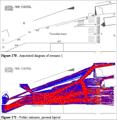
The stylised plan used in the Legion simulation is annotated in Figures 169 and 170.
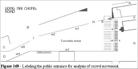
People enter at A, B, C and D. Area B is where people alight from vehicles (for example taxis) area E are the members/staff turnstiles. People leave via A, F and G, areas w1, w2, w3, w4, w5 and w6 are where people were observed to wait
Although not part of the congestion problem it is worth illustrating the turnstile counts from the simulation with the measured turnstile data (Figure 172), in order to verify the consistency of the Legion system.
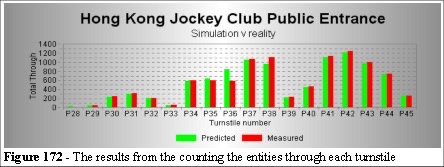
The simulation demonstrates that the entities are behaving as if they were real people, reading and reacting to the environment, as we anticipated. These results are not related to the kiosk problem but they illustrate the uneven turnstile usage.
The space utilisation maps are cumulative. Whenever an entity occupies a point in space, the colour increments. By using the same input data (from Figure 163 and allowing the entities to navigate their own space we create comparative maps.
After N minutes we can capture the maps and process the images. By simply counting the pixels of different colours we can measure the ergodic nature of the crowd dynamics for different designs and compare their effectiveness.
A single red line, for example, represents no-overtaking in any section as the focal route has encountered no instant over the period of time (N) where any entity has had the need to deviate from that route. By adding a flux to the speed of the entities and degrees of noise in their objective direction we can also test different types of behaviour. This is useful when assessing the impact of two different designs.
8.4.6 Conclusion: Public entrance
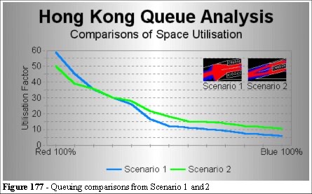
Queuing analysis for a two channel system with Poisson arrivals and Exponential service times would not discriminate two designs which differ in geometry. This has been a weakness of Queuing Theory. Waiting and service times are influenced by the interaction of the crowd with the local geometry, both before and after the queue. Comparing space utilisation maps, in different configurations, provides us with a qualitative and quantitative analysis which supplements queuing theory and the gradient (Figure 177) is a measure of the interactions between entities. If we narrow the width and extend the barriers we can measure the "fairness", or stability, of the queuing system. In this example, the steeper the slope the more jostling, and opportunities for queue jumping exist, hence instability.
In the original design the approach to the kiosk (from left and right) was not "fair" in that a delay on one kiosk prompted queue jumping. Good design forces perceived "fairness" on the system, it reduces the opportunity for queue jumping.
Our entities are trying to exploit least effort and in doing so they show us the weakness in both our design and in the conventional numerical solutions to these type of problems. Space utilisation for widths of corridors, the effects of right and left hand turns, the interactions of crossing flows, all of these factors now become quantifiable when designing a system for maximum efficiency using ergodic maps.
With the combination of the space, density, speed and alert maps (where high speed reduction occurs in areas of high density we call the interface an alert zone: the areas where the highest potential for crushing exists) we have developed a system that can measure the effects of the geometry on the crowd. When these results are coupled with conventional techniques a clearer understanding of the human behaviour in confined spaces emerges.
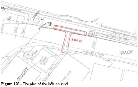
8.5 Area III: Happy Valley - Infield tunnel
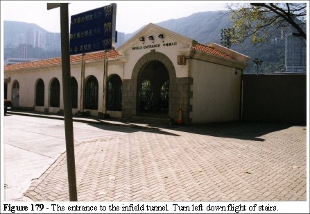
The third area we modelled was the infield tunnel at Happy Valley. This is located at the opposite side of the racecourse (Figure 178).
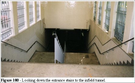
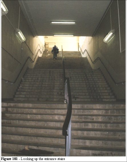
This area is a public entrance to the infield area (the viewing area is cheaper than the grandstands). The capacity is 6,000 but can be increased during the event. Although the entry to the tunnel is marshalled by police there are no checks on the numbers entering. From the entrance there is a left turn down a flight of stairs.
8.5.1 Infield tunnel statistics
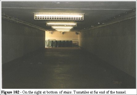
The distribution of the turnstiles was obtained from information provided by HKJC. Video footage in this area (coupled with the poor lighting) could only proved us with general flow patterns at the end of the tunnel furthest from the turnstiles. However it was as expected with the turnstile utilisation being highest on the shortest route through the infield tunnel. P06 is located on the inside bend of the tunnel. Focal route analysis predicts the highest utilisation as the records confirm.
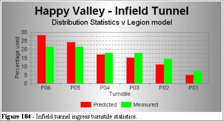
We can see (Figure 184) that the model has a higher usage at P06. In the model we simulated an even distribution across the whole period whereas in reality the people arrive in small clusters (train loads). By altering the input distribution curves we can change the "goodness of fit". The skill involved in the analysis of the arrival rates, as in queuing theory [92] is an important aspect in assigning the correct values for the model, namely we need to apply the correct arrival and service values.
8.5.2 Infield tunnel entrance
When the racecourse is used for other events such as New Year celebrations and pop concerts ingress capacity can increase to several thousand patrons flowing through this area. The infield tunnel is 4.5 metres wide and 48.6 metres long (on the lowest section). With the potential of a large crowd descending the stairs, any blockage at the turnstiles would quickly fill the lower tunnel and the consequences could be catastrophic.
Figures 185 and 186 show the ingress rates for the afternoon and evening race meetings. The bulk of the patrons arriving in the hour prior to the first race.
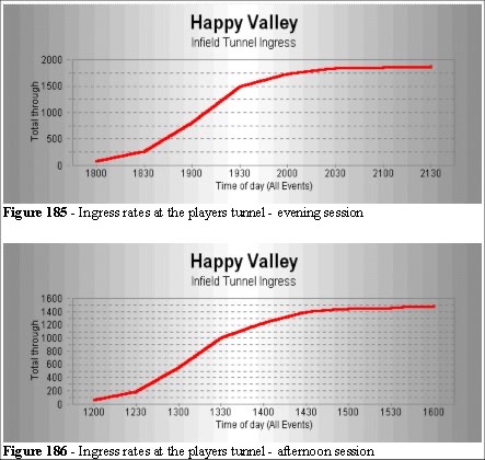
It was noted that the periods of highest flow rate were similar in time to those at the public entrance, but with a larger number of patrons using this area in the evenings (by 25%). The highest measured ingress rate was approximately 1,000 people per hour. The capacity of the infield, during race meetings, is 6,000. The tunnel capacity exceeds that volume at 4.5 metres we have a measured flow rate of
1000 ÷ 60 ÷ 4.5 = 3,704 people per metre per minute
From the Green Guide we note that the safety limit of 109 people per metre per minute for level ground (the tunnel) and 73 people per metre per minute (for stairs).
(2013 Update - it is important to note that the figure of 109 people per metre per minute was based on the Green Guide, Govt. Guidance Document for Safety at Sports Grounds - 4th Edition. The 5th Edition of the Green Guide revised those figures DOWN to 82 people per metre per minute on the flat and 66 for stairs)
Therefore the maximum flow rate in this are is 73 people per metre per minute (limited by the stairs 2 * 2.9 metres wide). We have 6 turnstiles with a service rate of 360 people per minute (1 second per person average) and an arrival rate (maximum) of 73 people per minute over 5.8 metres = 423.4 people per minute. These lead into a corridor of 4.5 metres (which would allow 490 people per metre per minute). We use the lower figure of 423 people per minute for the arrival rate. These are the typical calculations used in safety analysis. However they assume even distribution across all turnstiles. However, these calculations, used for the assessment of how many turnstile are required are constrained, during ingress by the width of the door (2 metres) so given that the maximum flow rate the whole system can allow is 2 * 109 = 218 people per minute - less than half the capacity of the tunnel. At those levels the requirement is 3.6 turnstiles (218 ÷ 60 people per minute), so 4 turnstiles would be the minimum requirement in this area. There is a similar constraint when people move from the infield back through the tunnel (two 1 metre sections either side of the turnstiles). The main problem is the lack of control on entry. In January 1993 at Lan Kwai Fong, not far from the Happy Valley Racecourse a disaster occurred. More than 20 people died in a crowd crush on a busy street. From Mr. Justice Bokary’s Interim Report into that disaster [95].
A number of persons, more or less in a row and more or less at the same time, lost or were deprived of their footing and fell. Because the press from behind was overwhelming, more and more people started falling. People piled upon those who had gone down before them. The pile grew until it reached such a height that the people immediately behind it were propped up by it and pinned against it by the press of people behind and upslope of them. Thus came about what some witnesses have called a "human wall". Tragically, men, women and children had the breath of life crushed out of them. 20 persons died very quickly, one more died in hospital some days later...
Also from The Daily Telegraph, June 1, 1999
An unprecedented tragedy happened on May 30 in the centre of the Belarusian capital. Over 50 people died and some 300 were wounded in a crush at the entrance to the underground station...The tragedy was caused by heavy rain that started at about 8 p.m....A few thousand Minsk residents, mostly young people, had gathered ...The first thunders and rain drops made people rush to find shelter in the underground crossing...Somebody fell down on the concrete floor and the first blood was shed. People were slipping over and trampling those lying on the floor...People were falling at the feet of the crowd. Over two thousand people poured into the 10-metre wide underground crossing thus creating a dense moving jam...there were people literally smeared against the walls, pressed into the floor, ...Meanwhile, screams of those who were unable to escape on their own, kept echoing from this hellish meat grinder...
"We are soccer fans, so we know what to do in a crowd – cover your head with hands and make your way to the exit."..."People kept arriving until there was almost no space and then the whole mess started. There was no escape. The people surging in from behind just left the others lying and walked over them," one of the survivors told Russian television.."About 300 people were lying here, one layer on top of another," a policeman said "We were carrying out the top layer of people and they were still alive. Those in the bottom layer were either dead or injured." Two policemen were caught in the crush and also died as they tried to rescue those who had fallen...More than 150 people were taken to 10 hospitals in Minsk as doctors battled through the night to save the lives of the victims in the tragedy. In his speech president Lukashenko said "There is nobody to blame, there is no one to make a claim to, it happened because it happened, even if there was anybody responsible it was the rain that caused the disaster."
It only takes one or two people to trip in a high density, high speed crowd and the consequences are disastrous. At Belarus the combination of factors should have been countered by good design. The combination of a large crowd flow, steep stairs, a narrow enclosed space is, without question, unsafe. The design was to blame.
8.5.3 Details of the infield tunnel
The approach to the entrance has wide footpaths, a large passenger drop off area, and a good clear walking route from Station (to the right of Figure 179). The flow of people entering the tunnel is monitored by video cameras. Should a problem arise, either on the stairs or in the tunnel, there would be nothing that the ground staff could do to prevent further ingress in this area.
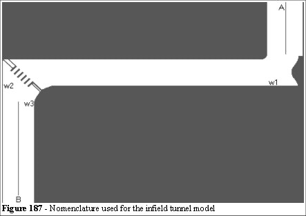
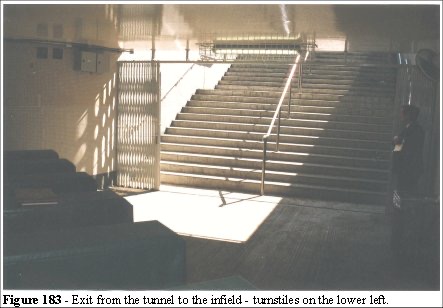
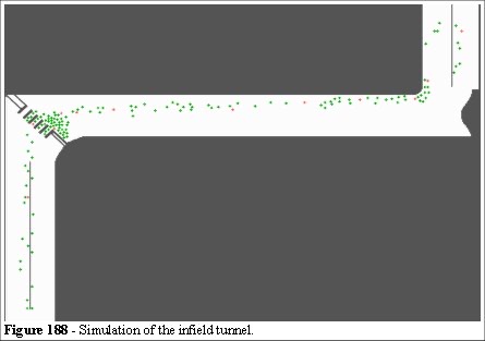
People enter at A and leave at B. Areas w1, w2 and w3 are areas where people were noted to wait. An area of concern is the position of the turnstiles (on a 90 degree turning point - Figure 187). The simulation shows how quickly that flow can congest in the tunnel (Figure 188). A point to note is lack of ventilation in the tunnel. This leads to discomfort and a potential risk to health in moderate congestion.
The problems can be addressed in a single solution. First we simulate the present scenario using the Least Effort algorithm.
8.5.4 Resolving the problems
If you can hold people in open space outside the tunnel then they can be regulated as they move into the tunnel. With appropriate crowd management this will stop any congestion occurring within the tunnel. To achieve this the turnstiles were moved to street level and relocated in place of the solid wall (Figure 179).
Further crowd control measures are positioned two metres in front of the turnstiles. This will slow down people approaching the turnstiles and allow time to complete their transactions.
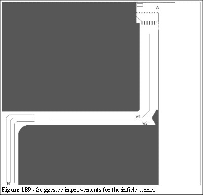
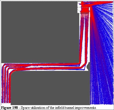
The second improvement was the crowd-controlling measures inside the tunnel. Figure 189 shows additional barriers. These barriers ensure an even flow of people through the tunnel with gaps to allow lane changing if one of the routes becomes congested. The space utilization map is shown in Figure 190.
Crowd segregation, using barriers, alleviates dangerous congestion. Any congestion or problems are now in free space, in areas outside the tunnel entrance.
8.5.5 Conclusion - infield tunnel
The resulting alterations would have a direct impact on safety for higher density crowds; which can be the case for as few as 1,500 patrons passing through this tunnel during a racing event.
There would not be any requirement for any increase in manpower to manage these changes for normal use as this is passive safety design. If staff have to be used to control crowds then the opportunities of human error are introduced.
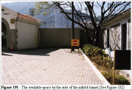
There is a need to design a passive crowd control system. People approach from the camera position in Figure 191, pass through a series of barriers, into the change turnstile area, then down the stairs. This regulates the flow and any congestion or sudden surges have no potential of rippling down the stairs. The proposed design would eliminate any potential for a repeat of the “Belarus incident”.
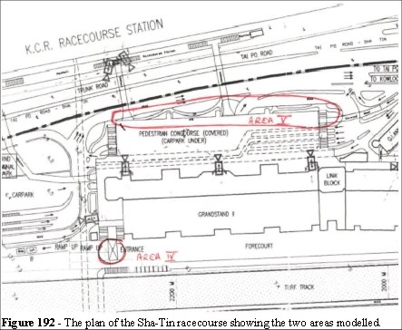
8.6 Area IV - Sha-Tin - Gate 1
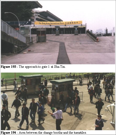
The fourth area we modelled was gate 1 (indicated on Figure 192). This is a public entrance to the Sha-Tin racecourse and is approached from the bottom left (Figure 192). Due to the land reclamation, which results in substantial subsidence, the approach to gate 1 is on an upward slope, with an over-pass from the road sloping downwards. The view from the approach road, shown in Figure 193, has a disused guards booth on the left and directly in the field of view are the two change kiosks.
The members’ gates are located to the right of Figure 193 and in direct line of sight from the approach road. From the overpass members have to move diagonally across the area in front of the turnstiles. The problems here are mainly layout-related. Queues around the change kiosks and the location of the guard booth obscure the lines of sight. Security staff were observed using a loud hailer (foreground in a white shirt Figure 194) to direct patrons to the public gates. This area appears chaotic.
8.6.1 Gate 1 statistics
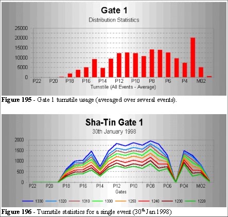
Figure 195 shows the distribution statistics from the turnstiles, averaged over several events. There are two superimposed normal distribution curves here (as expected) with a disproportionate flux at P3. This is due to the lines of sight and location of the turnstiles and members’ entrance (as seen from Figure 193). This is the reason why the security guard has to shout at people to move them away from that area and towards a less used turnstile. In one recorded event (Jan 30th 1998) it became apparent that the distribution changes dramatically if P5 is taped off and P4-M1 are used for Members/badge holders. The focal route analysis shows the routes.
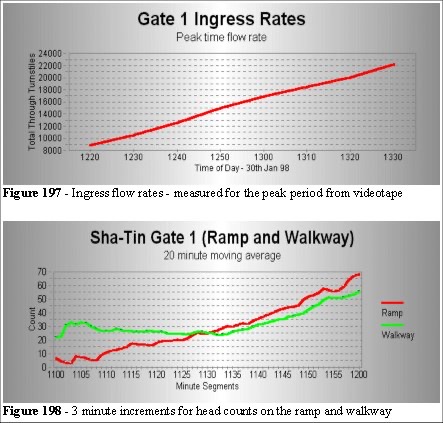
For the event (30th January) we also measured the peak time flow rates (Figure 197). This shows a steady flux of patrons during the peak period.
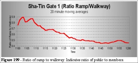
A further set of statistics was obtained by counting heads for one event relating the usage for the walkway to the down ramp (Figure 198 and 199). This shows that the walkway has a steady stream of patrons increasing by 50% near the start of the event start, while the down ramp has a steady increase. The net effect is that patrons crossing to the members’ entrance find it more congested closer to the start of the event (due to the problems of cross flow).
8.6.2 As-is model: Gate 1
Gate 1 is situated away from roads and parking facilities with a long approach. However, there are areas that will benefit from design changes and clear signage. The one area that cannot be altered is the gradient leading up to the turnstiles, which causes a line of sight problem. The present design, signage and gradient can be clearly seen in Figure 196 along with the tarmac repairs which act like a "runway beacon" guiding patrons along a desired central route (probably more by chance than design). The attraction of people "following" lines has been documented by Fruin [6] et. al. and skews the input for a queuing model.
The signs indicating each section of the turnstiles are difficult to read, even when the area is deserted. The distractions that occur when moving in a crowd add to that difficulty. The inability to select an optimum route from a distance creates cross flows and uncertainty closer to the entrances. This area is not laid out to facilitate ease of use by the patrons.
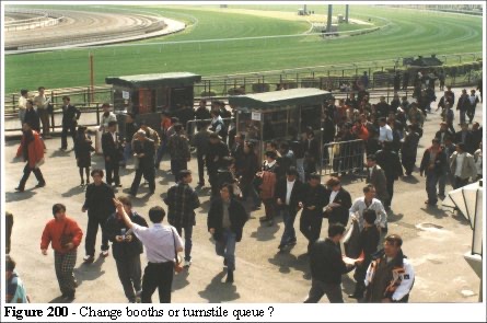
The second obstruction is the disused guard booth, which blocks the view of people who do not need to use the change kiosks. The third problem area is the location of the change kiosks, which has a considerable effect on the freedom of movement in the surrounding area. With the barrier system presently in use only the front four people are queuing, and order quickly deteriorates behind forming a huddle (Figure 200). Patrons then do not know if they are queuing for change or if this is the turnstile queue. This is accentuated by the slope towards the kiosks (Figure 193).
The Least Effort algorithm and focal route analysis is most effective in these situations as it tells us where the natural flow lines of the crowd should be. We can then design around the Least Effort and focal paths.
On the approach side of the kiosks, this congestion compounds when people approaching the kiosks either join those already there or walk around the queue.
The proposal is to redesign the layout of this area using the same principles applied in the Happy Valley public entrance. Several models were suggested; we describe two of them here. In all of the alternatives the guard booth was removed and clear signage was installed with appropriate respect to the layout.
8.6.3 The Legion models
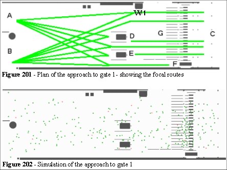
People enter via the ramp (A) and the walkway (B) and move, via the turnstile to C. D and E are change booths. F is the members entrance. Area w1 are where the season/concession tickets are collected. The focal routes have many intersections.
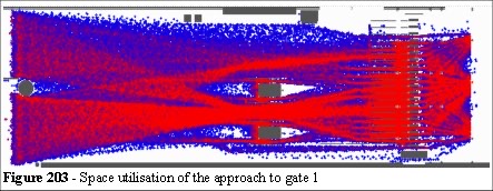
We can see the effect of the multiple focal routes, the nature of the problem between the change booths and the turnstiles (not enough space) and the heavy congestion on the central turnstiles (Figure 203) as the focal theory predicts.
8.6.4 Shortening the distance
The area can be altered by providing more space, or by reducing the distance between the change kiosks and the turnstiles (Figure 204).
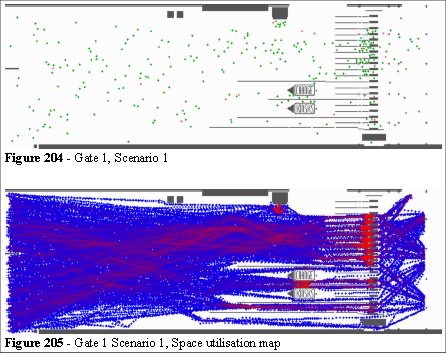
The two kiosks have been moved towards the turnstiles and brought closer together. This does not alter the operational efficiency of the kiosks. Barriers have been erected around the kiosks, back along the entrance routes, allowing people who wish to use the facility to form orderly queues rather than spreading out into the focal routes of other customers.
Moving the booths closer opens more space in the run-up and allows greater clearance. With this design the turnstiles have been split into five main areas. From bottom to top (far right) they are:
- 1. Members
- 2. Promotional/Season Ticket Holders
- 3. Change Kiosks
- 4. General Admission
- 5. Exit Only
This layout takes away the problems caused by the unchecked build up of people and sight line difficulties experienced at present, but in doing so it takes up six turnstiles solely for the benefit of those using the change kiosks.
Using figures supplied by the HKJC, out of 10,482 people using this entrance 1,740 used the change kiosks. The figures do not justify six turnstiles used for 16.6% of customers, leaving 83.4% to enter via the remaining nine.
Figure 205 and 206 shows the space utilisation map for the people passing through the model after fifteen minutes. This demonstrates that efficiency is impaired, and flow is less than the original. We redesign the area distributing the turnstile in a more representative allocation. Note, that in moving the change booths closer we are allowing more space for patrons to choose their appropriate route. This occurs in an area which is larger than the present scenario and we can see the effect on the space utilisation maps.
8.6.5 Arranging the space
Figure 206 shows the space utilisation map with change booth relocation and turnstile reallocated in the appropriate ratios for members and public.
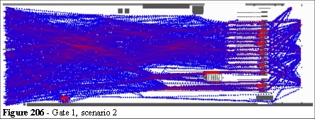
We can now use either the dynamic space utilisation map (points incremented by usage and decremented by a time factor, for example every 50 frames the whole map decrements one colour bar) or the cumulative (static) space utilisation. This allows us to compare any time segment for "cumulative utilisation from time 0" or "space used in last X minutes". As patrons arrive (Figure 198 and 199) at different rates from different directions we quickly saturate a cumulative space utilisation maps, hence the use of the dynamics maps.
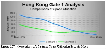
Comparison of the 15 minute dynamic space utilisations for scenarios 1 and 2 we see that there is a more even use of space in the second scenario. We designed the allocation of the turnstiles and the positions of the change booths to suit the focal route requirements and the patrons needs. We can measure the effectiveness of our design from the slopes of the two lines in Figure 207: a 15% improvement.
8.6.6 Conclusion: Gate 1
The two alternative scenarios offered for gate 1 both improve the public's approach to the turnstiles. However, scenario 1 has a higher space utilisation curve. This can slows the ingress flux compared to scenario 2, which is 15% more efficient.
For average attendance figures this would not have any adverse effects, for example, from queuing theory, we can see that the Poisson distribution of arrivals can have clusters causing queues to form. Scenario two gives the best results whilst maintaining the benefits of more logical and evenly distributed space. The improved space utilisation of the same area means that the clustering effect will not add to the service rates through this area.
We also observe different patterns of use for different time periods. An interesting analysis is the differences seen in the space required for ingress and egress. The two different modes of movement, slow ramp-up for ingress and sudden large movements for egress have very different space requirements. Figures 8, 38, 40 and 42 of Wembley turnstiles and Figure 193 (right) show exit gates either side of ingress turnstiles indicating that quantitative space utilisation analysis may save considerable costs in the design of these areas. Combining effective ingress systems with effective egress systems has enormous cost benefits to stadia and racecourse by reducing the need for real-estate.
The gate 1 example demonstrates that using space more effectively improves the quality of the experience of the patrons. This can increase the numbers attending the venue and hence the issues of safety, both for queuing and for emergency egress, need to be tested. The graph of attendance in Figure 154 indicates a drop in attendance over the years. We can test the scenario for different ingress numbers, at different times and different ratios, using Legion as a "what-if" tool.
8.7 Area V - Sha-Tin - Concourse
Area V is shown in Figure 192. This area is both an ingress and egress route for 40 to 60% of the patrons via the Kowloon-Canton Railway (KCR). The crowd flow from the station to the racecourse is regulated by the train capacity and the KCR timetable. Ingress rates present no problems for the existing design.
Problem occur when 20,000 to 40,000 patrons leave at the end of the event and the concourse area is inundated. The crowd is restrained by the use of holding pens (Figure 208 to 210). Figure 211 shows the movement of people through a section of the pens. and Figure 212 shows the exit from the pens, across the bridge to the station platform.
The platform capacity is 3,500 people which is the same as the train capacity. The first problem is the delivery of 3,500 patrons (trainloads), in controlled bursts, to avoid dangerously overcrowding on the platform. The second problem is, in the event of an emergency, the need to disperse patrons held in the pens quickly and efficiently.
Typically around the patrons (30,000) arrive within 15 minutes of the end of the races. This need regulation of the crowd flow from the concourse to the station platform to prevent serious injury due to dangerous over crowding in the station.
HJKC have designed a queuing system to regulate the crowd flow via a complex series of barriers, pens and manually operated gates. The system relies on the experience of key personnel using their judgement of the flow rates through the pens. Any system that has to rely on a few individuals to make spot decisions involving safety is high risk. A moments lapse of concentration, a poor line of sight or an incident that diverts the focus of the staff attention from the queuing, for example, a fire, traffic accident etc, would have catastrophic consequences.
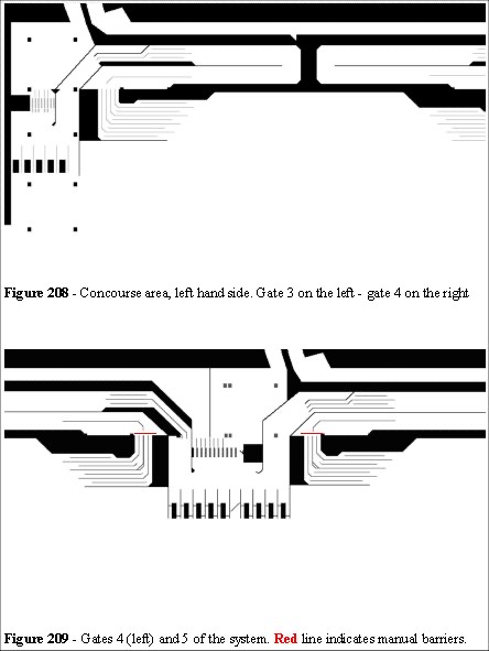
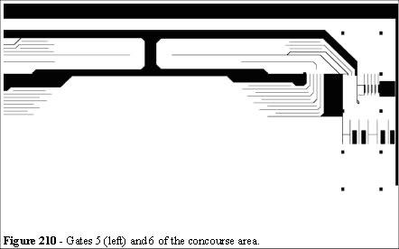
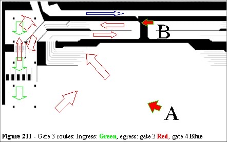
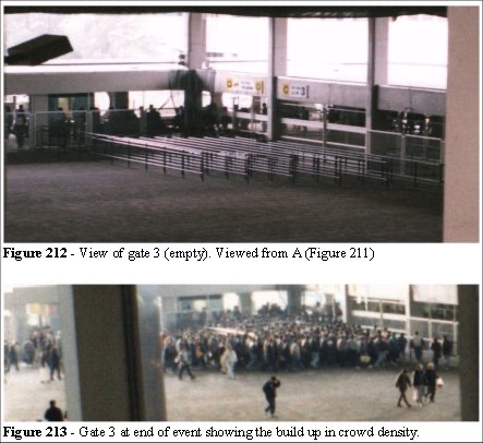
Figure 212 shows the empty gate 3 barrier and pen arrangement. Figure 213 shows the crowd overflowing the barriers. Gates 4, 5 and 6 are equally full. Figure 214 is a photograph taken of the inside section of the barriers, taken from position B in Figure 211.
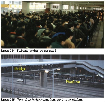
The staff assess the crowd flow and density in the pens (Figure 214) taking the numbers on the bridge and platform (Figure 215) into consideration and shut the barriers (Figure 209) when they judge the numbers of people exceed the safe packing density on the platform. This decision includes a phase delay in that they have to judge not the present platform density, but the platform plus bridge density.
With training this can be achieved, but there are two bridges serving one platform. The system relies on one central controller, with a walkie talkie radio, telling the other three barrier controllers to "shut the gates".
Two bridges (called the Middle Bridge and South Bridge) lead from the concourse to the station. A third bridge (to the North) has a lower flow rate but serves the same platform. That bridge has no flow control although it can be accessed from the concourse (Figure 192 top left). Once patrons choose a gate they are committed to a fixed route through the system. Subsequently, in the event of an emergency egress they are equally committed to the same route back.
8.7.1 KCR entrance/exit system - present design
At present the operational procedures and responsibilities for egress at four gates (Figures 208 to 210) are divided between the HKJC, the KCR and the Police. Responsibility for the areas is subdivided into regions. Division of responsibility is by the arrival and departure of trains (KCR), volume flow of passengers (HKJC), and by physical area (Police). The overall safety of patrons is the responsibility of the Hong Kong Police.
Ingress considerations for these areas are dependent on the KCR timetable, and the number of people using the service. The station is used solely for the racecourse and services the concourse area only. The concourse doubles as a golf driving range during non-event days so there is no potential to increase the barriers and pens into the fee-earning space of the concourse.
The design for ingress requires no modifications. Egress presents problems for all aspects of design and operational safety. The main area of concern is the barrier control system which has been designed to regulate the crowd flow and allow rapid egress in event of emergency evacuation, for example, a train breakdown.
8.7.2 Egress considerations
The train departs with a frequency of one train every 3-8 minutes; therefore, 6 to 12 trains are required to clear the crowd from the concourse. There is 2,918.4 square metres in the pens for a throughput of 30,000 people.
Walking the distance through the pens takes 90 seconds (on average) in free space (120 metres). The bridges have 4.4 metres of effective width which, at 109 people per metre per minute, is equivalent to a flow rate of 479.6 people per minute.
With the available width of the two bridges it therefore takes approximately 7 minutes to reach platform capacity of 3,500 people (at the highest possible flow rates according to Green Guide calculations) from empty.
The bridge is 50 metres long. Allowing a packing density of 4 people per square metre we have 4.4 metres (width) * 50 metres (length) * 4 = 880 people per bridge. After 7 minutes a total of 1,760 people are on the bridge and 3,500 on the platform. As the rate of filling the bridge is more than the rate of trains extracting people from the concourse we cannot devise a system that allows the bridge to have less than a full load of people. Otherwise, with 3 minutes between trains at peak periods, most of the trains would leave partially empty.
Furthermore, from the end of the last race it takes 15 minutes for all of the patrons who want use the station to arrive. The 5,200 are on the platform and bridges in the first 7 minutes. We therefore need capacity for approximately 25,000 people. At 4 people per square metre we need 6,250 square metres of space. There are 2,918.4 square metres. We proposed extending the barriers by 1,000 square metres to accommodate those arrivals without a significant encroachment into the driving range space. This has the additional benefit of allowing a more even distribution to all of the gates. In the original design there was a bias to gate 3, 5 and 6 due to sight lines. As previously stated, to fill the platform takes two bridges worth of people. A simple measure for the staff is to follow a person moving across the bridge, when he reaches the far side, follow a second, you now have an approximately full platform. This method is unreliable, but it does provide a rough estimate for practical purposes.
8.7.3 Evacuation procedures
We were asked to design an appropriate egress system for the barriers and pens. A number of procedures would be required to handle this situation in the present design.
- Stop any further patrons entering the queuing system.
- Close the first manually operated gates and reverse the flow back through the concourse area.
- Ensure the second manually operated gate is open and that people are moving forward in order to get clear of the centre section of the queuing system.
- Open the HKJC turnstiles’ shutters to allow passage of the crowd back to the safety of the concourse area. These, along with the KCRC turnstiles, should be allowed to "free flow", or the leg barriers should be held open.
- Release people heading to the platform to egress via the turnstiles, leaving space for any train evacuees.
- Evacuate of the train and station areas.
This is a complex process and a simpler and faster method was sought.
8.7.4 Modelling evacuation
We modelled the evacuation of the platform via the bridge and the turnstiles. The as-is model gives rise to two major areas of concern with this evacuation. The first area is the central section of the queuing system, which is closed by a high mesh fence. Once this section has filled with patrons, lines of sight become restricted and, in an emergency this would lead to confusion and distress.
The other area of concern is the area between the second gate and the KCR turnstiles. This area is prone to high density crowds and requires a method for rapid clearance to prevent injuries. Two model were created and evacuation times were compared. We will focus our attention on the gate 3 egress section to illustrate the principles as, in essence, the whole system consists of four very similar sections.
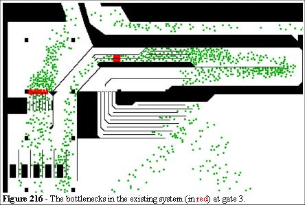
To assess the egress capacity of the existing design we look for the narrowest points (bottlenecks) along the egress route and calculate, using the Green Guide values, the flow capacity. This is a “rough-cut” analysis in which we determine the scale of the problems. Figure 216 shows the bottlenecks. We have assumed the manual gate is closed and the patrons in that area are moving back into the concourse area. The dimension of the egress routes are: 40, 40, 90, 40, 70, 60, 60 cm. Although this is a total of 4 metres of exit width (426 people per minute), no single route meets the minimum safety requirement as stated in the Green Guide. It is important to note that the Green Guide is a British document and, although internationally accepted, it is not as rigorously applied around the world. We note that people are packing to 6 people per square metre in the existing pens. Hong Kong has the highest population density in the world so people are used to packing to these levels. The “rough cut” analysis using the higher figure of 6 people per square metre highlights the problems of an emergency egress from this area. We may have as many as 18,000 people in the pens, a further, 2,640 people on the bridges at 6 people per square metre and flow rates of up to 180 people per metre per minute. The huge differences are partly due to the smaller frame (80% of the area a UK shape occupies) and partly due to a high density tolerance.
There is space on the left-hand side (Figure 216) for a crowd, in excess of the egress rate, to be held in relative safety. The pens to the right are a more serious problem and they both narrow along their route, and the potential for a crowd crush is self-evident. We are now able to use the anthropomorphic tables from (Table 4) the speed distribution (Figure 56) and the speed density curves (Figure 135) to assess the local characteristics of this population.
8.7.5 Alternative for safe egress
Two alternative designs were tested. The changes relate to the evacuation process and consist of a three-metre wide sliding gate in the perimeter fencing. The gate would be opened only if an evacuation were necessary. Once opened the police would direct the crowd from the rear of that area out to the relative safety of the concourse. Figures 217 to 224 show the existing system
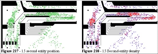
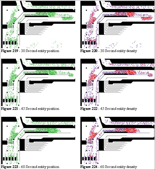
Using the Legion simulation we can assess the densities during egress, high density exposure, the total evacuation time and the flow rates at various sections in the model. This allows us to assess where the design needs to alter.
From Figure 223 and 224 we can see that the people in the middle of the barrier/pen configuration are trapped. They cannot escape in either direction and there is danger of crowd crushing in this section. We can remove a section of the perimeter to allow these entities to find a better egress route.
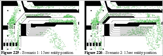
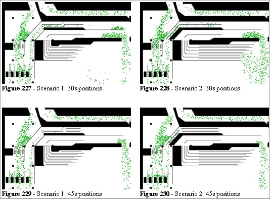
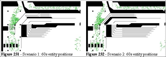
In Scenario 1 (Figure 225) we open a section of the perimeter (during evacuation only) and find that there are still problems when the entities try to find a way out of the system. Scenario 2 (Figure 226) has a different configuration or the internal barriers allowing the entities to flow more efficiently, yet still be controlled by the existing gating system. Figures 227 to 232 show the simulated egress for the two alternative solutions (side-by-side).
8.7.6 Study points for the simulation
The three issues that were studied in these scenarios were:
The queuing system leading up to the first manual gate (note the extension to the barrier in Scenario 2 in Figure 232). These extensions balance the crowd distribution in the barriers and spreads crowd over a further 1,000 square metres for all four barriers (3,4,5 and 6) and changes the ingress focal routes.
The gate installed for an evacuation (to the right in Figures 231 and 232).
The relocation of the second manual gate along with the extension of the redesigned barrier lanes. This change is applicable only for gates 3 and 5.
The as-is model shows the uneven distribution between gates 3 and 4. The shorter sections of barriers were changed resulting in people merging prior to the corners - giving more time to self-order before channelling through the manual gate.
The evacuation gate has been installed into the high fence using the same dimensions and operational requirements in both scenarios. This addition is the most important safety feature of the proposed changes to this egress system.
The third change is the second manual gate and the queuing system that lead up to gates 3 and 4. After study of the plans and testing the simulations for a number of different scenarios, it was observed that changing the design to mirror those of the gates 4 and 6 was the most effective. Changes to procedures were also noted:
Individuals are required only to move forward rather than reverse flow.
The repositioning of the second manual gate restricts the "unregulated" area allowing for greater control throughout the system.
In the case of an evacuation this design would have a major advantage with a more ordered egress.
In all of the above scenarios no changes have been made to the evacuation procedures for moving people away from the train and platform. Figure 233 shows the comparative egress times for the pens in the three configurations: as-is, scenario 1 and 2. We have taken these times for the central pen area to clear of entities.
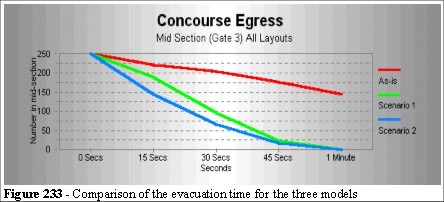
8.7.7 Conclusion: Concourse simulation
Operational procedures are dependent on available platform space and hence the frequency of train arrivals. The areas modelled relate to proposed design changes which will improve the egress of the pens. These changes reduce the high density ingress and improve crowd safety both for normal and emergency egress.
Chapter 2 - Crowd problems and crowd safety
Chapter 4 - Principles of a simulation
Chapter 5 - Legion (agent based simulation)
Chapter 6 - Validation of a computer model