6 Introduction
Galea [24 - section 7.0] includes a thorough description of the process of validating a computer simulation. We shall use that outline as a framework for the discussion of validating the Legion models. The following section is heavily paraphrased from Galea adding comments where they relate to Legion.
Validation is one of the most often used and abused terms in computer modelling. We shall use the term validation to mean the systematic comparison of model predictions with reliable information (Fruin [6], Togawa [29], Green Guide).
Fruin’s measurements were detailed in his book, Togawa data is referenced in both the Building Research Establishment document [29] and from Pauls [21, 22]. Ando [7, 8, 9, 10] studies of passenger flows provides very similar speed/density relationships to the Togawa data series. Kendik [79, 80] and Pauls review a variety of data sources and outline the Predtechenskii and Milinskii [51] measurements from more than 3,600 studies of different buildings. They show a wide variance in the speed/density relationship showing a graph illustrating the differences.
From our own field observations a similar conclusion is drawn. The field data is wide ranging. The approach taken by Legion shows that these variations are explainable. This adds weight to the earlier discussion that the speed distributions are the basic measurements required to determine the limits for risk assessment. Validation is an essential step in the acceptance of any model. While no degree of successful validation will prove a model correct, confidence in the technique is established the more frequently it is shown to be successful in as wide a range of applications as possible.
Another issue which is often confused when attempting to assess or validate model concerns the question, are you assessing the model or the engineer? These are essentially two ingredients which make up a successful crowd dynamics model, the model (code and data) and the user of the model. When setting an assessment it is essential that the contributions from these two ingredients are not confused.
An excellent model in the hands of a poor engineer will not produce reliable simulations, and a good engineer with a poor model will also produce poor results. Both the components need to be assessed. It is possible to set tasks which will separately assess the suitability of the model and the engineer. To improve the engineer, training is required. To improve the model may require additional software, or a better understanding of the phenomenon under investigation. We will concentrate on issues relating to the evaluation of the model.
6.1 Validation components
For any complex simulation software, validation is not a "once and forget" task, but should be considered as an integral part of the life cycle of the software. There are at least four forms of validation/testing that the crowd models should undergo. These are
- Component testing
- Functional validation
- Qualitative validation
- Quantitative validation
6.1.1 Component testing
Component testing is part of the normal software development cycle and involves checking that individual components perform as intended. At the lowest level this involves routine testing that the software engineer goes through to test each code fragment.
At the highest level, the user can run through a battery of elementary test scenarios to ensure that the major subcomponents of the model are functioning correctly. For a crowd dynamics model this may, for example, involve checking that a person with an unimpeded travel rate of 1 metre per second requires 100 seconds to travel 100 metres. We call this test the100m dash test. The simulation has to demonstrate that at all angles the entity is being displaced at the correct rate.
Further component testing consists of breaking the simulation into a series of geometrical tests, door width testing, barrier models, speed/density, histogram inputs and speed/density measurements as outputs. For this we apply the assimilation test (described in the previous section). The random number generators are each tested to ensure that there are no biases creeping in from numerical weighting errors. We also test the components across different platforms and on different computers. An example would be taking the original programme written in QuickBASIC and comparing the output results to the same algorithm written in C and the newer routines developed under C++.
We invert the logic conditions across code segments testing whether a specific logic statement is correct as illustrated below. This eliminates conditional errors. The two statements below are equivalent.
IF A ≥ B THEN A = C ELSE A = D and IF B ≤ A THEN A = C ELSE A = D
Wherever possible multiple programmers have tested individual sections and the process of porting the algorithms to other languages has been checked.
Quality assurance is an ongoing process of component testing, this consists of breaking the code into segments that can be tested individually. At present the source code and algorithms are being tested independently.
After every change in the library code the tests (calibration runs) are performed again.
6.1.2 Functional validation
Functional validation involves checking that the model can exhibit the range of capabilities required to perform the desired simulations; this requirement is task specific. A battery of geometric models is used: corners, corridors, single and a bidirectional flow test; the speed/density and 100 metre dash tests (where the entity is timed moving a distance of 100 metres) are also used to determine whether the model is functional. This is part of the ongoing calibration studies and prior to every job we perform a range of tests.
One test is to determine the relationship between speed distributions and local geometry. As there have been a number of field trials, confidence in the system is high. However it is under constant review and newer, more efficient algorithms are being added.
Functional validation to determine the safety limits in an environment is an ongoing process. For instance, an evacuation model which is simply used to check compliance with standard prescriptive building regulations would need to be able to calculate features which are specified in the appropriate building code, such as maximum travel distances and available exit widths for evacuation purposes. However, a model used to demonstrate compliance with a performance building code may need to be able to predict evacuation compliance with scenario-specific conditions. This would require the capability to include response times and overtaking, queuing, turning arcs etc. Ideally each of these options should be included in the fundamental output options from the software. There are systems on the market that use the Green Guide, Fruin and various other field data to prove compliance. We question the validity of those models: previous sections indicate the areas in which their results are doubtful.
6.1.3 Qualitative validation
The third form of model validation compares the nature of predicted behaviour (in our case human behaviour) with informed expectations. While this is only a qualitative form of validation, it is nevertheless important as it demonstrates that the capabilities built into the model can produce realistic behaviour. The nature of the demonstration examples needs to be relevant to the intended application, and to be of sufficient merit to satisfy the intended clients or approval authority.
The tests against the geometry of Wembley Stadium, Balham Station and the Hong Kong Jockey club have proved the analysis capability of the Legion system but further tests are planned. The process of qualitative validation is also ongoing.
6.1.4 Quantitative validation
Quantitative validation involves comparing the model predictions with reliable data generated from experiment. Attention must be paid to the integrity of the data, the suitability of the experiment, and the repeatability of the experiment. Clearly there are issues here relating to the nature of crowd safety that can never fully be tested. The only reliable footage of a major crowd disaster was obtained from the Hillsborough incident. Camera technology (1989) and the resolution of video tapes is improving. Working with the Emergency Planning College and the police national operations facility (Bramshill), where reports of all major crowd incidents from around the worlds are collated, is again an ongoing process.
The question remains: which aspects of the numerical predictions are to be compared with experimental data? This is somewhat dependent on the nature of the intended application. Ingress calculations, for example, may be performed with reference to safety limits (provided that density is always below critical limits). It should be remembered that models can produce a large variety of outputs, not simply the total egress time or average density.
The aim of quantitative validation is to demonstrate that the model is capable of reproducing measured behaviour. Hence it is necessary to specify suitable acceptance levels. Do model predictions need to be within 5% or 50% of measured values? This must take into consideration not only experimental errors but also the repeatability of experimental data and whether or not data from a single or multiple experimental runs are available. To be truly useful, quantitative validation should have a diagnostic element which allows the developer (and assessor) to pinpoint areas requiring further development. In summary, the processes of model building and simulation are interactive.
Finally, at least two types of quantitative validation should be performed. The first involves the use of historic data (as discussed in the next section). In this case the user performing the validation has knowledge of the experimental results. The second type involves using the model to perform predictive simulations prior to having sight of the experimental results, a so-called blind prediction. Both are valuable: however, the acceptance level for both types of validation exercises are not necessarily identical.
In our specific case the tile prediction from Balham (chapter 7) and the turnstile prediction (chapter 9) were blind results, as was the pattern and usage of turnstiles at Wembley in chapter 3.2.3 (we predicted the pattern of usage at turnstiles a priori). Comparisons of the simulation output to Fruin, Togawa and the Green Guide are quantitative validations using historical data.
As building codes all over the world gradually move towards performance-based regulation, building designers are increasingly finding that the fixed criteria of the traditional prescriptive methods pose too restrictive demands on evacuation capabilities. This is due in part to their almost total reliance on configurational considerations such as travel-distance, exit widths etc. Furthermore, because these traditional prescriptive methods are insensitive to human behaviour or likely egress scenarios, it is unclear if they indeed offer the optimal solution in terms of evacuation efficiency. Computer-based evacuation models have the potential to overcome these shortfalls; however, if they are to make a useful contribution, they must address the configurational and environmental behaviour, and procedural aspects of the evacuation process. Evacuation models are beginning to emerge which addresses all these issues. Legion is one such tool.
While the mathematical modelling tools of the safety engineer have proliferated, there has not been a corresponding transfer of knowledge and understanding of the discipline of crowd dynamics from expert to a general user. It would be naive to assume that in the space of seven years all aspects of crowd safety have been researched and fully understood. It is the aim of this type of simulation to set the foundation for a greater understanding of problems associated with crowd dynamics with specific reference to crowd safety and risk assessment.
The computational vehicles to run the models are not, on their own, enough to exploit these sophisticated simulations. Too often, they become black boxes producing magic answers in exciting colour graphics and client-satisfying imagery. As well as a fundamental understanding of the human psychological and physiological responses to crowded environments, the safety engineer must at least have a rudimentary understanding of the theoretical basis supporting crowd dynamics truly to appreciate their limitations and capabilities.
A lack of understanding of crowd dynamics, coupled with the inevitable complacency that attaches to individuals responsible for crowd safety, is a dangerous mix. There is a need to educate governing bodies, owners, and operators of venues, and the general public, about hazards related to crowd safety.
6.2 Observations and procedures
The Legion model has two internal parameters (angle and check path). These parameters relate to the angle of deviation, weighting of course correction and scanning range. We also have to include one external parameter, the speed distribution. The internal parameters are set in the program and relate to field observations. The external parameter is user defined.
People have an anthropomorphic shape which determines their range of movement. These characteristics (size of a pace, speed of movement, length and breadth dimensions, perceptions of minimum distances and angles to objectives) are treated in the simulation as entity level code. Each entity has its own profile and can determine its own objective by reading their environment and course correcting.
The read and react cycles are coded into the basic algorithm. To determine the values of these parameters we first refer to video analysis. The required parameters were measured as follows:
- Angles The angle at which people change direction (for this a downward view of a large area was used).
- Length of pace This allows us to determine the resolution of the models. This can be achieved by measuring ground based grids. Tiled areas are particularly suited for this purpose.
To measure these we capture video footage and mark the video view with either a ground-based grid and/or a head height-based grid. This can be done by using an acetate overlay on a TV monitor and marking it with an isometric grid. Using the slow motion and pause buttons on a video recorder we can measure the angles of displacement. During the analysis of angular displacement equipment was lent by Cubic Transportation Systems and consisted of a high resolution video player with frame advance capabilities, a multiplexer unit and several dozen videotapes from Balham Station.
It is possible to track people on the video footage and follow their progress. Balham Station was tiled and those tiles provided a useful reference point for the analysis of the angles people deviate when moving through crowded and empty areas. They also provided an excellent reference for density analysis. When we are calibrating the models, we have to check the plans to ensure that the details provided are correct. One should never assume the information on a plan to be 100% accurate for a calibration study and it is vital to measure the critical dimensions oneself. These include all dimensions of places where a crowd can accumulate, such as barrier widths, doorways, corridor widths (and lengths) and turnstiles. Site plans typically do not represent an as built environment. When the building is constructed (from the same plans) it is often not re measured to ensure accuracy. Most site owners can see that the plans are roughly right, and never question the centimetre accuracy required for a calibration study.
We also need to measure the distances over which we can observe a range of individuals over a range of densities walking through a clear path in a straight line. In all field studies the site was measured by using tape measures and electronic devices to ensure that the scales and sizes were correct.
We can determine the focal routes, those areas which have strong visual clues which act as the direction the people will move. They are constructed using a simple geometric analysis, and we describe this method in detail when we discuss the Balham study.
6.2.1 Validation stages
The three stages required for the validation study are:
- Initial Survey An initial site survey is useful checking abnormalities in the site, such as lighting, egress signage, management practices and we also check the field of view from the video cameras.
- Validation During this stage we measure the angles in field of view, captures the relevant video footage, digitise the plans of the site (taking care about resolution and size of the areas/density of populations). We perform a head count, to observe the typical behavioural characteristics of the crowd under examination. We also take notes of demographics, clustering (how many small groups form, for example families) and the general atmosphere of the crowd.
- Simulation run Once we have entered the data into our simulation the model is run with some local objectives placed on focal routes. The models allow manual placement of these. Care must be taken over the visual perception where strong signage/floor marking or management procedures (such as marketing information handouts) impede flow of the crowd.
When we were in the early stages of developing a model for crowd analysis in a specific environment, extra care was taken to check all the assumptions relating to crowd dynamics, specifically the visual acuity of the site. As we have seen in the Wembley turnstile analysis, the location of signage can influence the crowd dynamics. The present algorithm scans an area in its field of view 7 - 8 metres ahead. This conforms to the Fruin findings [6 - page 4] where he highlights the evasive manoeuvring distance as 25 feet (7.62 metres). The studies conducted indicated that this is an average and is a function of the speed of the individual. We have linked that parameter to the individual. Future implementations may have user defined variable settings.
We enter the range of speeds of individuals (typically during initialisation of the simulation run). These are normally distributed and have been discussed in detail in previous sections (mean 1.34ms -1 std. 0.26). We discuss the field measurements in more detail below.
6.3 The validation tool
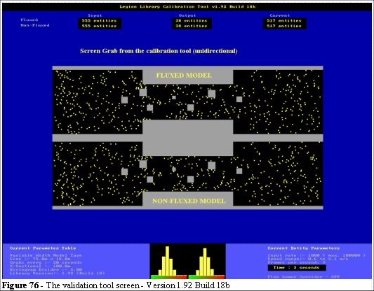
The screen layout for the validation tool (Version 1.92 Build 18b) is shown in Figure 76. The basic elements in the tool are the dual screens, top and bottom, which run different algorithms through the same geometry. The speed distribution from the top screen is shown on the left-hand histogram and speed distribution form the bottom screen is shown on the right in Figure 76. These enable us to run different types of parameters through the same geometries, and visually analyse the differences.
6.3.1 Validation tool output
The validation tool creates a variety of output data. In addition to the simulation screens we can produce numerical results in the form of spreadsheet data and we can produce screen images (grabbed in PCX format). The combination of watching the models runs and analysing the output provides us with an instrument for dissecting the forces at work within the dynamical system. We use a variety of maps in the validation tool to perform our analysis. These are:
- Entity position - The entities are the yellow squares that move in black areas (Figure 76). For models of a few thousand entities the model runs in real-time.
- Space Utilisation - As space is occupied by the entity the colour increments per unit time. Thus a pixel becomes more red the more often it has been stepped on.
- Entity Density - There are two ways of measuring density: taking the number of entities per unit area; and calculating the local density in a radius from the entity. We shall use the latter, which we call the dynamic density, in this analysis. This method of measuring density means we can measure the entities’ exposure with time.
- Speed Average - This map displays the average speed of the entities at a specific location, i.e. Each location is an average of the speed of the entities that have passed it. Thus, our map relates to the speed per unit area.
- Alert Map - This map indicates any area in which speed is suddenly reduced and high density is encountered. This map is important when we want to analysis the local crush areas.
- Vector Maps - These indicate the predominant direction of the entities per unit area. An arrow indicates the long term average direction per unit area and its colour indicates the long term average speed in that direction.
6.3.2 Scales used in the maps
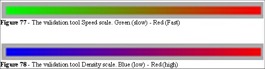
The Legion maps are the analytical output of the simulation system. They show, using a colour scale, a variety of features. A series of experiments has been created to test both the qualitative and quantitative validation of the simulation suite. The maps we shall use in this section are taken from the validation tools and are quantitative in nature. In the validation tool we use the green to red scale for speed, and the blue to red scale for density, as follows:
The tool has been designed for visualising both static and dynamic features and we shall explain these below. We also discuss the Space utilisation map which uses the same colour scale as the density map. Space utilisation is derived by incrementing using the plan of the area and incrementing the colour at each location stepped on. It thus represents the probability that some entity is at that location at a given instant, and can be considered as an approximation to a dynamically invariant measure of the crowd flow pattern. The areas used most in the model are therefore highlighted as red, those not used, remain black. We shall see how this feature allows us to derive a variety of information about how the space our model, and subsequently people, is used.
6.3.3 Fluxing and space utilisation
The validation system has dual screens. It can run two different algorithms through the same geometry; in this way, development comparisons can be made. The dual screen system also fulfils the requirements for component testing, since different algorithms can be compared both qualitatively and quantitatively.
We can also run the top screen in a mode we call Fluxed. This mode is a test for emergence, and consists of altering the speed of every entity at every step. The integrity of the speed histogram is maintained but the individual speeds are not.
In the non-fluxed model (bottom screen Figure 77) the entity speeds are set from the histogram and maintained throughout their existence. We can test the effects of local clustering and the difference between the two models to indicate the importance, or relevance, of the speed and space distribution for the crowd dynamics.
In both fluxed and non-fluxed models the map production algorithm is identical but we see fundamental differences between the two: as mentioned above, we observe the concept known in the technical literature as an invariant measure. This indicates a property of crowds not previously measured in that we can determine how much of the time is this point occupied, in the long run.
Ergodic theory [93] relates two different ways to construct such measures: averages over time (space utilisation is one example of this) and averages over space (flow of the crowd). We can produce a variety of maps for fluxed and non-fluxed models testing the effects of these averages over space and time.
6.3.4 The Legion maps
The maps are necessary to understand the dynamics of a crowd, and are integral to the validation of the algorithms within the simulation. They fall into three main categories:
- Location - The entity position maps, typically shown as yellow dots/boxes. These indicate the location of each entity, frame by frame as the simulation runs.
- Speed - Showing the spot (instantaneous values) velocity of the entities and averages over space and/or time. The cumulative (averaged) speed maps indicate the areas which have similar speeds during the simulation run.
- Density - Showing the spot (instantaneous values) density of the entities and averages over space and/or time. These indicate areas which have continual high density, an important consideration in the analysis of safety.
We also have other types of maps: for example the vector map, where the colour represents the velocity and the direction of the arrow represents the average angle moved by entities in that area, which we will also discuss. These maps are amalgams of the above and are based on the speed/density and location information.
There are many methods of calculating these values and care has to be taken when choosing the area over which we measure a value. For example, as we have seen in our previous discussion on static versus dynamic space, the value for densities (number of people per unit area) can be large in one area, small everywhere else and averaged to be nominal.
6.4 Qualitative validation of Legion
In this section we discuss qualitative tests of the simulation and determine whether it demonstrates the emergent phenomena that we observed in real crowds.
There are several emergent phenomena in a crowd flow. Many of these features have been observed by the author and others in field studies (Fruin, Togawa, Henderson, et. al). The production of a simulation, where various parameters can be changed and their effects noted bring us insights to the nature of these phenomena.
We focus on four of these, discuss how they occur in the crowd, and how the simulation demonstrates why they develop. The effects we discuss are:
- Edge Effects - Where the edges of a crowd move faster than the centre of the crowd.
- Finger Effects - Bidirectional high-density crowds flowing through each other with relative ease.
- Density Effects - Crowd compression in local areas can imbalance the crowd flow.
- The Human Trail - Erosion demonstrate the principle of least effort
We also highlight the differences between static and dynamic space utilisation, and the effect that has on density calculations.
6.4.1 Validating the edge effect
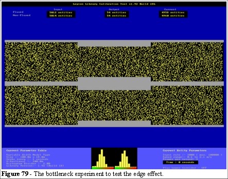
We describe an experimental model (Figure 77) that tests the effect of a bottleneck on the speed/density relationship. This test is strictly qualitative and we are testing the invariant measures, the impact on flow/density with respect to the BRE [29] statement highlighted in earlier.
We initially populate the model with a random distribution of 5,000 entities. Their objective is a simple left to right movement. The entities enter from the left at a rate of 3,000 per minute. The speed distribution is set for 1.34 ms -1 with standard deviation of 0.26 (as in Helbing). The model is 100 metres in length with three widths (18, 14 and 18 metres respectively). The entities are 30 centimetres square. We test a range of bottleneck widths.
6.4.2 The entity objective
Each entity is performing the same algorithm, but with different initial conditions. For every step the entity takes it scans the areas ahead (towards its objective) and solves the equation based on the least effort algorithm. We can state this as follows: Find the minimum distance to the objective at the maximum speed
In this example the entity is trying to reach the right-hand side of the screen at the speed it has been assigned from the speed distribution histogram. Entities are given a speed when they are created and they maintain that speed throughout.
The fluxed entities are given a different speed every incremental time step (frame). The integrity of the speed histogram is maintained in that the total entity speeds, prior to movement, are normally distributed. After movement the system collates the distance each entity has travelled. It does so in two ways. The first is to collate the distances travelled in any direction, as a scalar value, recording these against the time increment. The second is the distance travelled towards the objective, in this example that is calculated from the X, in the model this is the horizontal direction. We can then compare the input (desired) and the output (resultant) speeds.
The speed map records the scalar values and the vector map records the vectors. The speed average map then indicates the areas where, regardless of the desired speed, the invariant measures (both fluxed and non fluxed) are the same.
The speed v density results are discussed in chapter 6.5.
6.4.3 The entity position map
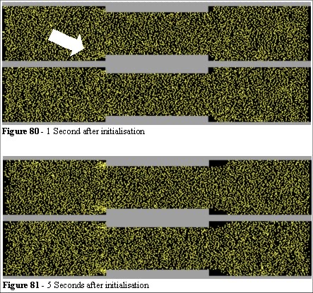
In the edge effect experiment the model is populated with a random distribution of entities (Figure 79). Figure 80 shows the initial movement of the entities. Figures 81 and 82 show that gaps begin to appear to the right of the bottleneck, and the density increases to the left of the bottleneck. We begin to see that the entities to the left are trying to avoid the protrusion in advance (arrow in Figure 80) but after a few seconds this movement is restricted by the other entities.
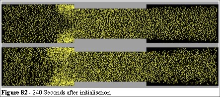
The patterns before and after the protrusions are now forming as we might expect. After four minutes the densities in the three sections are very different. Again this is expected and we can see that the model is producing visibly reasonable qualitative results. To examine the detail of the density across the model we switch to the Dynamic Density Map and Speed Average Map (Figures 83 and 84).
6.4.4 Dynamic and static density
In Figure 83 we can see there is a difference between the fluxed (upper) model and the non fluxed (lower model). The difference is also apparent in the Entity Position Map. There are significant differences in the Speed Average Map as we can see in Figure 84.
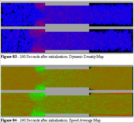
Two phenomena can be observed in Figure 84. On is the build-up of slow-moving entities to the left of the protrusion (the green area in Figure 84), and the other is the area of layering to the right of the protrusion (Figure 84, bottom and top of the bottom screen).
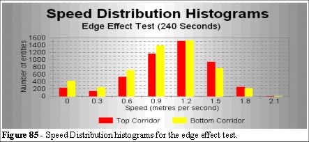
This layering is the result of entities that are at the high end of the speed distribution histogram, and find space to move into as they clear the gap. We should also note that there appears to be a higher level of green (low speed) colour in the central section. It is not possible to tell (visually) whether the speeds into and out of the section are different. For that analysis we look at the spreadsheet output. Figure 85 shows the speed distributions.
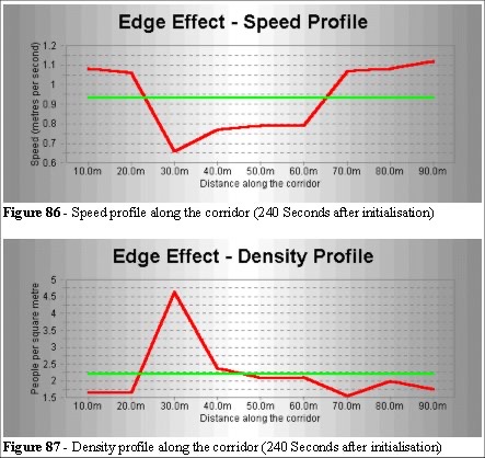
Figures 86 and 87 show that an average density, or average speed, values (shown as the green lines) do not represent the dynamics in this simple model. The Density and Speed maps (Figures 83 and 84) provide a more effective qualitative analysis of this environment. Also the clustering of the crowd is apparent.
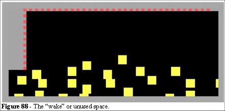
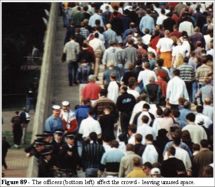
The wake (Figure 82) to the right of the protrusion is caused by the entities not using in the space beyond the protrusion, they are walking forward - not sideways. There is an area where the dynamic crowd does not occupy (or fill). 6.4.4 Dynamic and static density.
We now examine the “shadow” beyond the protrusion at a higher resolution. In the edge effect experiment we have narrowed a 18 metre corridor by 4 metres (2 on either side). We see from the model that the entities do not fill the area evenly, and as Figures 88 and 89. The calculation for density is measured from the total area available to the crowd. As the crowd does not use all of the available space the calculation for the speed and density would appear to be incorrect.
6.4.5 Space utilisation
The space utilisation map was presented in the introduction (chapter 1). In this section we discuss its application for determining the location for signage.
The entities seek a least effort route through complex geometries. As each entity takes its step the space utilisation of that point is incremented. We shall use points to mean the pixelation scale of the model.
In the simulation an entity advances to a new point and the point it then occupies is updated with the information relevant to its movement. Hence the maps represent the updated information of the entity. The same principle applies to speed.
The information we obtain from the map relates to the total usage of that space over the simulation run. In effect the space utilisation (as we discussed in the assimilation experiment) is the erosion factor.
From the space utilisation map we can determine the areas which would best serve the placement of information (signage) or act as an observation points for ground staff. These points are important for the design and optimisation of passive or active crowd management features. For example, a merchandising goal is maximum revenue, so the areas which have the most concentrated flows are naturally the most attractive for the concession stand. They are also the areas where the crowd would be most disrupted by queues.
Another type of space utilisation map is dynamic space utilisation. This increments each point per usage and decrements all points over time. The use of this map relates to the space utilisation time factor where we may be interested to examine the differences between the ingress space utilisation, egress space utilisation and the emergency space utilisation. Equally we can use this map to determine the required space for different densities and different speed distributions. Supposed we wanted to design a suitable route emergency egress route through one, two or three doors. The Green Guide, assumes a linear (double the width double the flow), relationship but the speed/density implies a nonlinearity.
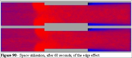
Figure 90 shows a space utilisation map from the edge effect experiment. We can see some interesting features from this map. Firstly, the areas to the left of the protrusions are similar in both the fluxed and the non fluxed map (Top = fluxed). This is because the space utilisation measure is an invariant measure: the feature it is detecting is how much has this space been used over this period of time. From Ergodic theory we can see that wherever the crowd density is high, the samples over time can be replaced with samples over space, the instantaneous flow-patterns in different runs taken under corresponding conditions will, with high probability, look the same as each other.
The space utilisation map in the Figure 90 is demonstrating that the space utilisation is not a function of the instantaneous speed, but is a function of the speed/density relationship.
We can also see the space utilisation to the right of the crowd compression, at the left end of the bottleneck (Figure 90). To the right of the bottleneck we see that the crowd is expanding into the free space; the rate of expansion is a function of the speed distribution of the entities.
6.4.6 Dynamic and static maps
The dynamic maps refer to instantaneous values such as the entities’ speeds. The static maps relate to an average over space or time. The nomenclature is arbitrary, these definitions serve to classify the different types of maps we use in the simulation. Let us examine the cross sectional density in the edge effect experiment.
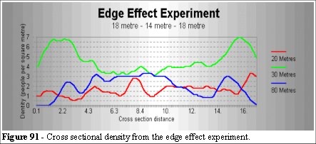
Figure 91 shows us sections along the horizontal axis of the density across the vertical axis (note: the model is symmetrical but we are using a moving average to clarify the graph, hence the apparent left to right bias in the cross section).
We can see that the cross section produces different information from an average over area value. There are sections in this model which are constantly in high density and others which are constantly in low density. We do not perceive this information from a single value, for example an average of 1.5 people per square metre may be true in the above example. Once again this highlights the assumptions of speed and density used in the safety guides are not appropriate measures.
We need to know the time an entity is exposed to high density we can monitor this by recording its density exposure as it progresses through the model. This is a very important measure when we are trying to assess the safety of the individuals in the crowd.
We are now facing a problem of potential intractability in that we could test every parameter against every other parameter in every geometry. Which parameters are important ones depends on the type of environment we are analysing. There is no generic solution to the problem: it is a question of experimental design.
For example the concourse outside gate C would be suitable for a maximum density, maximum time exposed measure, but space utilisation would not provide any insights in this area. The concourse area we described in chapter 3.3.4 would be more suitable for space utilisation analysis as the feature we are most interested in is the exploitation of short cuts, where the space is most used, and to what extent does the density effect the flow rates. The total space utilisation is of interest in concourses during ingress and egress. We may want to isolate a feature of a specific area and determine the maximum capacity across a range of densities. We may also want to examine that area for the last five minutes, or five hours. Such an evaluation would be of relevance if, for example, we wanted to test the potential damage to a grassed area in an open air concert.
Equally the measure of density in a static environment, for example, an area where crowds move slowly (say gate C at Wembley) should not be compared against a measure for density in an area where high speed may be expected. They represent different levels of safety. Therefore we use different maps in different applications.
6.4.7 Validating the finger effect
The second emergent effect discussed in the introduction is the finger effect. (Figures 9 and 10). We now examine how this effect arises, and give further evidence that the Fruin assumptions cannot be universally applied.
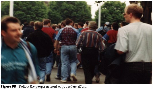
It takes less effort to follow immediately behind someone who is already moving in your direction than it does to push your own way through a crowd. We can set up an experiment model to test if this hypothesis pertains to the bidirectional behaviour of a crowd and gives rise to the finger effect in high density areas.
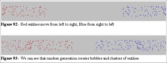
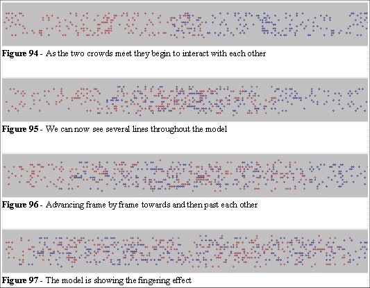
Figures 92 to 97 show a simple model of entities moving from left to right (red), and right to left (blue). To the left and right the entities are being created at random entry positions. Their algorithm is simply to avoid at random (up or down in the model) whenever they encounter an entity moving in the opposite direction. This action forms chains of entities walking in line, as we would expect.
When we create a simple model that displays some of the underlying mechanisms of a crowd we must examine whether those principles are representative of human behaviour.
The mechanism for crowd self-organisation appears to be linked to both space exploitation and the propensity for people to choose the least effort route. This is modelled in our simulation by random avoidance. Examination of video footage has shown no predominance for handedness and the finger effect appears with equal frequency left and right. The entities in the model all move with the same speed. As a real crowd increases in density we find that the slowest members of the crowd “throttle back” the speed. This is due to the reduction of overtaking opportunities.
The model can be confirmed from video footage, or walking through a high density crowd. At this simple level the mechanism for the finger effect appears qualitatively correct and, in this respect, it confirms the least effort hypothesis.
6.4.8 Validating crowd compression
We have seen in chapter 3.3.4 that the crowd compresses when turning corners. We also see from the edge effect experiment (Figures 80 to 91) that the compression in the bottleneck has a definite density/speed profile. Furthermore we have seen (chapter 6.4.4 and from Figures 88 and 89) that this effect can create problems for general density calculations. At low density the effect is negligible, but at high density our models indicate that this effect will create flow restrictions.
Another effect to note from Figures 88 and 89 is that the crowd does not expand into free space after a constriction. As the crowd is moving the available dynamic space is less than the static space used in the calculations in the Guides. This is an important consideration for the calculation of density, and does not appear in the literature, guidelines or egress calculations in the building regulations.
The simulation contradicts aspects of the guidelines and the evidence from the field observations supports the model. When the building has sufficient area available for crowd expansion (holding reservoirs) and no constrictions, then the existing guidelines have proven sufficient. However, where compromises have been made, where space is at a premium, and where the guidelines leave room for interpretation there is a requirement for an appropriate model.
6.4.9 Validating the human trail
During the development of Legion it was conjectured that the space utilisation map could be applied to the problem of path formation. Helbing [13] describes a process where human trails form across a Stuttgart campus. If a space utilisation map were used to re-create the plan and the model rerun then the iteration of space utilisation map and plan ought to produce a similar result.
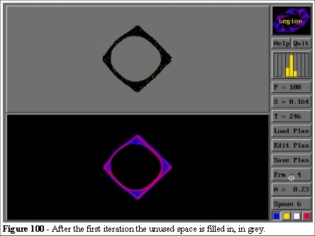
In this experiment we shall use another of the development tools (the QB45 interface). Four points (North, South, East and West) are created around a circle.
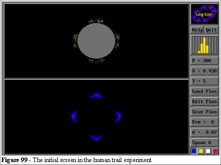
In this model (Figure 99) the top screen is the model plan and entity position map, the bottom screen is the space utilisation map. After a few hundred frames we will use the space utilisation map to redraw the plan (the top screen in Figure 99). Taking a limit of 0-3 hits on the space utilisation map to represent little use, for example, if this is grass then it is growing unimpeded. 3-7 hits represent retarded growth, and 7-13 hits to represent a die back; where the grass is being destroyed.
After every pass the entities are reset and move towards a randomly selected objective (N, S, E or W). The algorithm allows them to navigate through the available space and the iteration process erodes the circle on the routes used more often. One would expect the ideal network to be a cross within the diamond. The model evolves to this ideal as it represents the dynamic equilibrium of erosion and growth given that the entities are seeking a least effort route.
After a few frames the circle has developed a lopsided appearance. This is due to a slight bias in the selection of the East objective. At 15 frames the symmetry in the process is observed. At 23 frames a route (top right) is underused and the “grass” closes that route in the next iteration. This symmetry-breaking is typical of the assimilation algorithm. Figure 106 and 107 show the entities moving through the model and we can see that the high density cluster of entities (at the centre of the model in Figure 107) is similar to the behaviour we discussed in chapter 3.2.
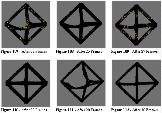
In Figure 109 the paths are nearly straight. The entities moving E-W and W-E hug the shortest path round the bottom the NW triangle. This erodes the lower edge of that section. It is thus not surprising that the ideal solution is achieved. We have created a model which is seeking a path of least effort. The entities try to take the shortest route, and the rate at which we permit evolution, competition between the entity and the environment, erosion and growth will eventually lead to the ideal. Figures 111 and 112 show the experiment with different parameters for assimilation rates and number of entities.
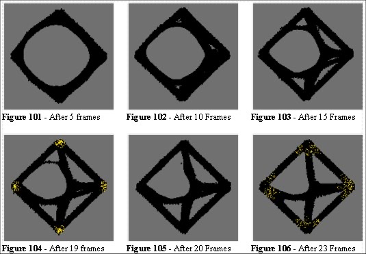
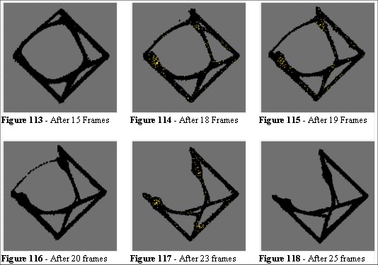
The symmetry-breaking feature in this experiment is interesting. To examine this we can set the parameters to 100 entities and 400 seconds (Figures 113 to 124) and observe that at 15 frames the solution is similar, but different paths are forming. To analyse the nature of the symmetry breaking in this algorithm we construct a test where the rate of growth and rate of erosion are more evenly matched. We use 100 entities and 200 seconds per frame. Figure 115 shows that the West to North route is going to fail through under-usage. In Figure 116 the effect of the algorithm closes that route and in Figure 117 two pockets of entities, the N-W and W-N groups, cannot reach their objectives. We also observe a symmetry along the NW/SE axis.
There is a feature we can use in this algorithm. Consider Figure 117: here the two groups (N-W and W-N) are oscillating at a location which is poised between two equidistant routes (the algorithm can perceive neither alternative as shorter). The algorithm has no solution from that point and the entities oscillate at random until they escape. This is the ideal location to place signage and the algorithm has determined this location for us. The oscillations increase the space utilisation in that area, and nodules (wide gaps) begin to form. In Figure 119 we can see another example of this phenomenon. These areas are places where the appropriate use of signage, or other crowd management measures are required. We therefore have a semi-automated method of establishing these locations.
In reality there would be a requirement for signage along the route but the model demonstrates one of the dialectic solutions; we are discovering that there are going to be problems in areas where a decision have to be made. In field studies we notice this effect at the top of escalators in railway stations. Without appropriate and clear signage the people hesitate, causing temporary blockages, then move off. This forms standing waves and congestion. Figure 124 is the final solution, and we observe a further feature of this type of analysis; the widths of paths (Figures 110, 112 and 124) are proportional to the number of entities, the required crowd width.
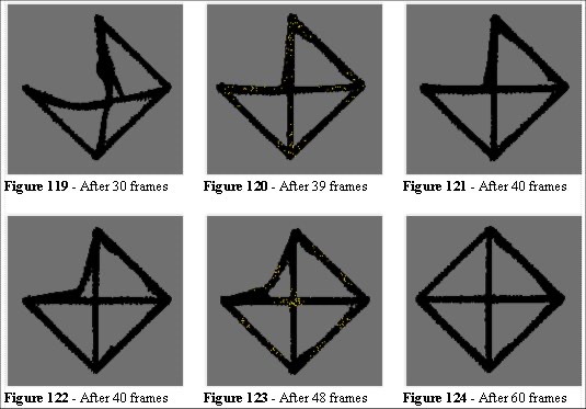
In Figures 121 to 124 we see the evolution of a short cut as it develops. We can now look for an examples to see if this phenomenon occurs in reality.
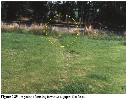
Figure 125 shows a gap in the wire fence (circled) and a trail beginning to form through the grass (towards the camera position on the designated path Figure 126). This route is a short cut to the bus stop (out of shot, to the left of Figure 125).
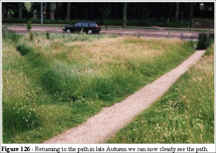
At this stage of evolution the trail is in the general direction of the road, snaking to the left and right of a straight line path. The erosion is beginning to kill the grass, the condition we defined in our model as the 3-7 hits range. Erosion and growth are poised in a form of dynamic equilibrium. We returned to this site several months later to see the development of the trail.
In late Summer the photograph Figure 126 was taken and we can see the erosion more clearly. The grass is more difficult to navigate and the trail straightens out. This is now similar to the scenario in Figures 121 to 124 where the erosion occurs at the edges of the path and the length of grass prevent a major deviation from the path. The evolution of the path has parallels in many biological systems which benefit from least effort which minimised the energy expended by the entity.
The evolution of animal trails, and in particular ant trails, is a well-documented process [63 to 75]. Figures 125 and 126 demonstrate that examples of the human propensity to take the path of least effort can be validated in everyday examples. People exploit short-cuts. Thus we have developed an algorithm based on the assumption that humans will exploit, wherever possible, the shortest route to their objective. Within this algorithm we have confirmed the findings of Helbing [13] and have offered new evidence that the problem of short cut exploitation is an underestimated phenomena in that design of places of public assembly.
The discussion relating to Wembley Complex Station (chapter 2.8) show that a model of the Stadium to Station area would have uncovered the alternative least effort short cuts. In that example it takes less effort to walk further than to queue for a long time.
The algorithm can be used in two different ways. Firstly we can use it to determine the location of appropriate signage. Secondly, we can use it to determine the optimal shape for corners, concessions and the development of human trails.
6.5 Quantitative validation of Legion
Galea [24] states that systematic comparison of the model’s predictions with reliable information is essential to the validation of a computer model. We now address the issue of reliable information.
Fruin [6] is an excellent reference but the environments he measured involved low density occupation, less than 2 people per square metre compared to the 4 people per square metre in a typical sports environment. Furthermore the pedestrian environment of a city street, with its many distractions, is very different from the designs intended for emergency egress. However, the Fruin data is available and we need to discuss how well the model performs to that data.
6.5.1 The Fruin data
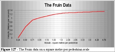
Fruin used time lapse photography to measure the forward displacement of pedestrians along a city street. He measured a variety of density and speed relationships and we can draw his results in two ways (Figures 127 and 128).
The Fruin Level of Service (LoS) has been used in pedestrian planning since 1970. Fruin [6, 54] has expressed concern that LoS is applied with proficiency.
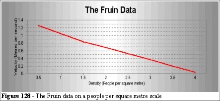
We note from Fruin’s observations [6 , page 73] that the sidewalk has an approximate width of 3 metres (10 feet). We also note from Fruin [6 , page 44] that a clearance of 1 to 1.5 feet is observed from the edges of the walls and pavement (sidewalk) edge. In our model we allow no clearances for edge avoidance, to do so would negate our dumb people hypothesis). We need to create a model 2.1 metres in width and set up the speed distribution to the Fruin data.
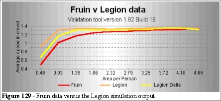
The orange line (Figure 129 - Legion) is the speed in any direction: the entities, if necessary, can move in a diagonal overtaking step. The yellow line (Figure 129 - Legion Delta) is the forward speed (the delta X displacement), measured along the X axis.
At high densities the fit to the Fruin curve is not close. We saw in previous chapters that Togawa and the Green Guide also do not agree with the Fruin data.
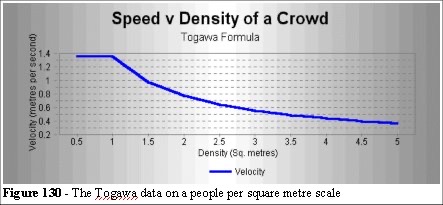
6.5.2 Validation against Togawa
We saw from chapter 3.1.6 that Togawa [3], Ando [26, 27, 28] and the Green Guide [19] are in close agreement. We use the Togawa formula (V) = Vo ρ -0.8 Where ρ is the density in persons per square metre. Togawa used Vo as a constant (1.3m s-1). We will use 1.34ms-1 as the constant, Vo, to keep it in line with observations of European crowds. Capping the upper speed value at 1.34 we get:
Comparing the Fruin, Togawa and Green Guide data together: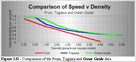
We can see from Figure 131 that there is a similar curve for the Togawa formula and the Green Guide. As both were empirically derived from large crowds, this is expected. However, it does highlight the differences from the Fruin data.
6.5.3 Validation against the Green Guide
The Green Guide data have been measured in and around Wembley Stadium (along with many other venues around the Great Britain). Comparing the simulation results to the Green Guide data we get:
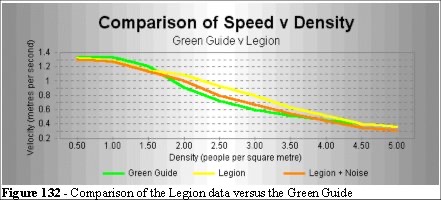
The Legion simulation is in good agreement with the Green Guide data. As the simulation is noise free, in that people in our simulation do not stop, hesitate, deviate, get distracted or fall over. By adding a 25% noise level to the entity interactions we can improve on the fit. The noise was implemented in the overtaking algorithm and we add a rule: 25% of the time the entity will choose to slow down and match speeds with an entity moving its direction instead of taking an optimal overtaking manoeuvre.
This lowers the curve, as in Figure 132. In low density this noise value has no effect as there are fewer overtaking opportunities. At higher densities the entities are affected more, hence the nonlinear relationship between curve of the noise free algorithm and the noisy algorithm. Field measurements confirm the overtaking value matches the overtaking potential in high density crowds. The relationship is a function of the local geometry and density. As the density increases the opportunities for overtaking decrease and their speeds homogenise.
6.5.4 Validation against Fruin
We plot the Legion output data against Figure 128 to see where the Legion simulation and the Fruin data differ. We also add different levels of noise.
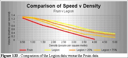
The addition of further noise brings the Legion curve down to the Fruin curve. From this we might conclude that the main difference between street crowds at low density and crowds in sporting grounds can be attributed to the distractions (noise) in the city street. We never reach the zero velocity that Fruin predicts as, in this experiment, there is always an egress route, our corridors are open-ended.
We can also look at experiments with the speed distribution curve adding wider ranges, skewing the graph away from the normal, and a variety of other factors. These changes are the subject of further field studies.
We made some measurements of speed v density at a London Station (Liverpool Street Station - underground platform section).
![]()
When we compare these data to Fruin, Togawa, and the Green Guide, the density was measured at 1.48 people per square metre, we get:
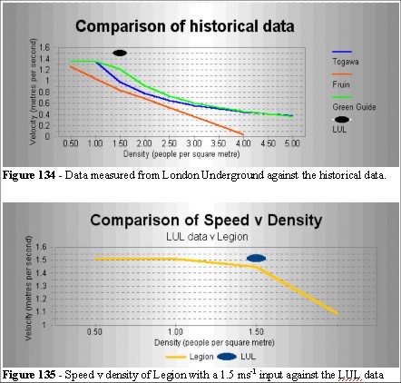
The Liverpool Street Station (London Underground) data (Table 6, 7 and Figures 134 and 135) is outside the Togawa, Fruin and Green Guide data.
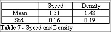
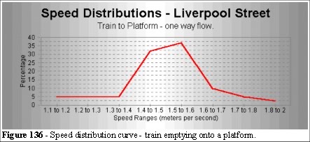
These results looks like statistical outliers, but when we alter the speed distribution in the simulation (Figure 137 and Table 7) we match the data.
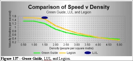
As we can see from Figure 137, altering the speed input to the simulation produces a fit to the LUL data (using a higher speed distribution as the input, in this case 1.51 mean with std 0.16ms-1 ). No other parameters of the simulation are altered. In this way we can demonstrate that the speed distribution of the entities is a controlling factor in the dynamics of the crowd. Our model is robust.
Figure 137 shows that the high density v speed relationship does not appear to be a function of the individual speed, but a function of the emergent speed of the crowd. A valuable insight to the nature of the high density crowd flow characteristic.
6.5.5 Validation against Paulsen
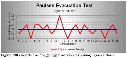
The Paulsen evacuation test (chapter 3.4.4) is an experiment in which he emptied a room 8.5 metres by 3 metres filled with people (door width of 1.5 metres). The results were mean 30.26 seconds, standard deviation 2.64 seconds evacuation time. We find that the results are sensitive to the speed distribution but taking the Helbing speeds (mean 1.34ms-1 with std 0.26ms-1) with the 25% noise algorithm the results were a mean of 29.9 seconds and standard deviation 2.07 seconds for egress.
6.6 Conclusions
We have seen that short cut exploitation can prove fatal (Hillsborough) and how the simulation can provide insights to the nature of these problems.
The data we have examined come from reliable sources. Coupled with our own field studies, we find that the speed/density relationship is a function of the speed distribution histogram. We also find that local geometry has a dominant effect on the speed/density relationship. The Legion simulation has the ability to differentiate the effects imposed by these relationships.
Our goal in this section was to prove that the simulation can reproduce the necessary data for crowd dynamics. Adding a level of noise brings the simulation from a sports environment into a street environment. The system can explain a range of behaviour including the edge effects, crowd compression effects, and the finger effect. The simulation can also determine the appropriate location for signage, and it allows the designer to determine the speed/density distributions in an environment.
Altering the speed distribution curve and the noise levels aids our understanding of how these parameters affect the crowd dynamics. We can be confident that the values are appropriate and we have a robust explanation of the mechanisms that drive crowd dynamics.
Chapter 2 - Crowd problems and crowd safety
Chapter 4 - Principles of a simulation
Chapter 5 - Legion (agent based simulation)
Chapter 7 - Case study 1: Balham Station